Perfume Package Design
-
August 2023 - December 2023
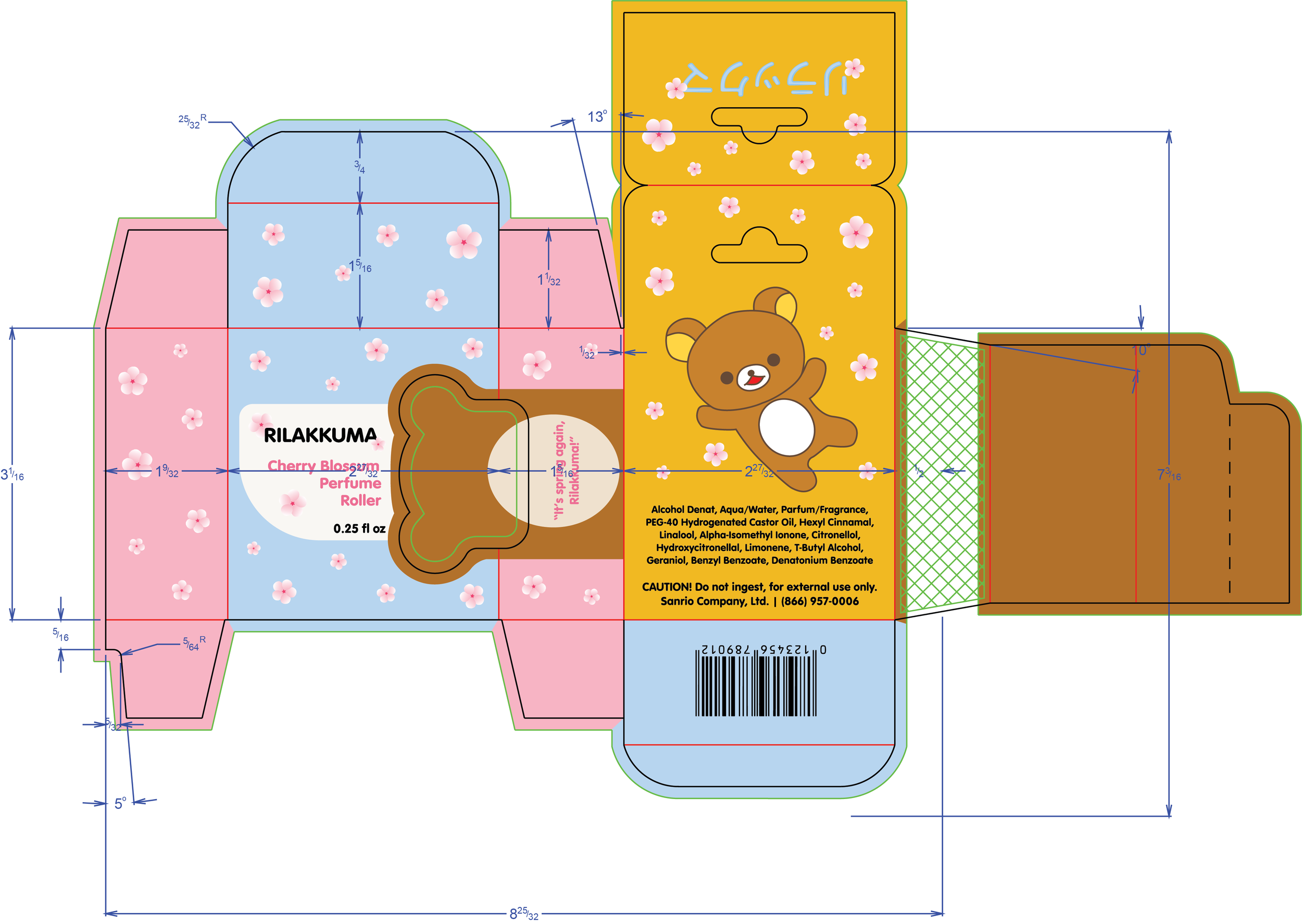
This was the final project for the class PACK.152, Packaging Design II. The goal of this project was to integrates the use of both ArtiosCAD and Illustrator parts of the class to create a folding carton with graphics for an imaginary product. I created a brand for the product which will be the theme for the graphics in both the carton and the product itself.
Some of the requitements for the final deliverable were a consistent brand identity that must be designed in full color utilizing CMYK, catch phrase to help market the product, text on the packaging including the weight of the product, ingredients and caution statement, the name of the company and contact information, and UPC.
-
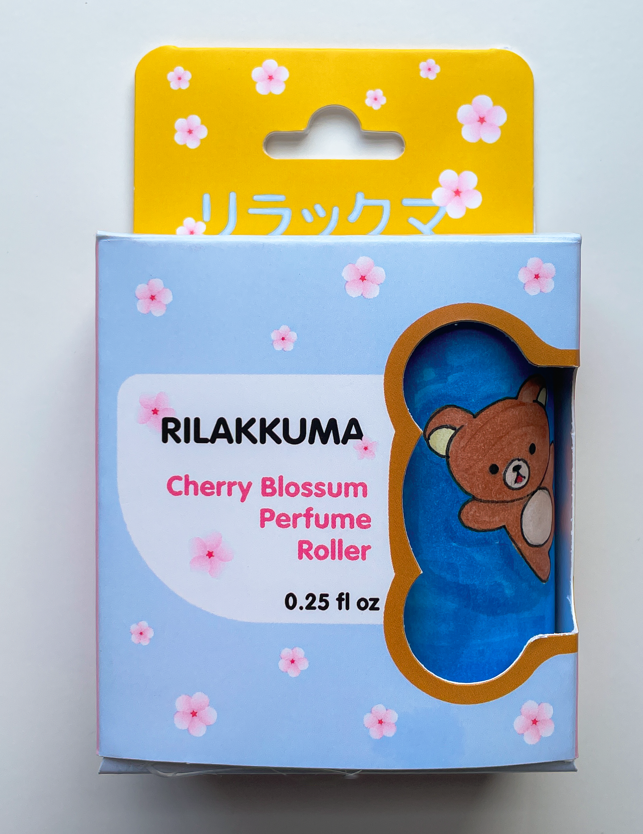
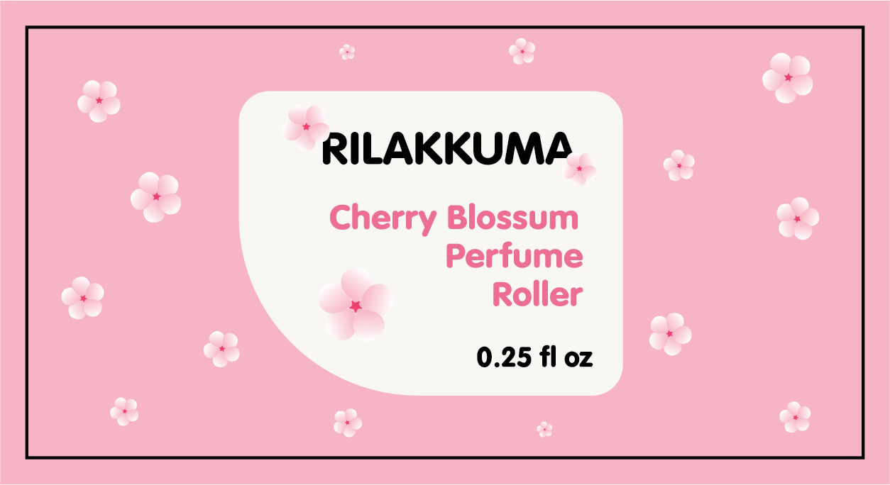
I decided my product based on the size of the item we were given, which I felt resembled a perfume roller. My design inspiration came from the Sanrio character, Rilakkuma, a small brown bear with a very cute and simple design. I felt that the aesthetic that Sanrio uses would be perfect for a flowery, spring, perfume, so I incorporated pastel colors such as blue, pink, and yellow, to compliment the warm brown of Rilakkuma.
I have found that in the past, my design work tends to be more busy, so I challenged myself to make this package very simple and have the most visually captivating part of the box to be the window cut out to see the product inside, designing it in the shape of bear ears that flow into a body design around the box.
This project was completed using ArtiosCAD, Adobe Photoshop, and Illustrator.
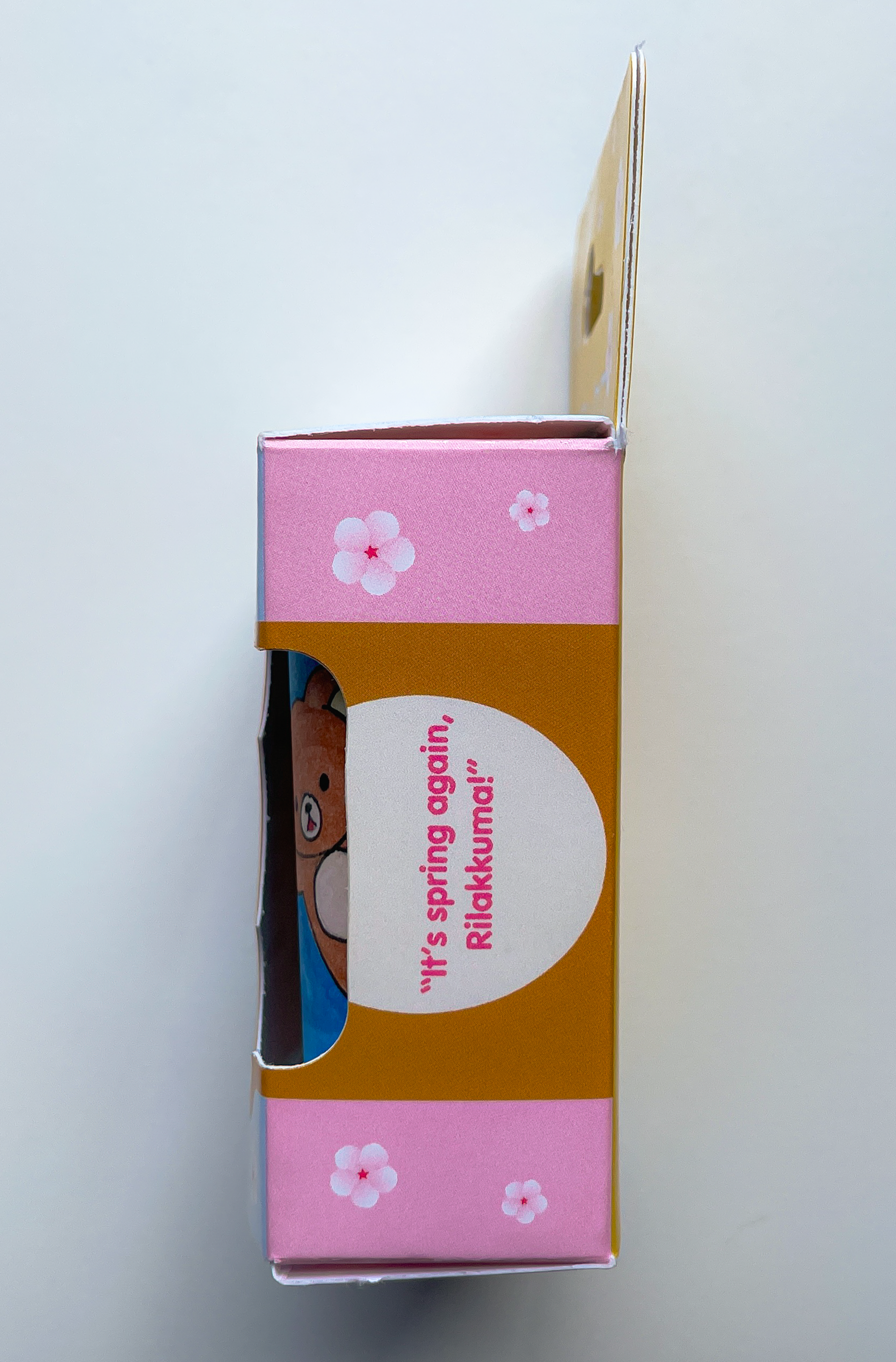
This is my final project from my Packaging Design class; a hanging box for a cherry blossom scented perfume themed after the San-X character, Rilakkuma. Rilakkuma, an anthropomorphized teddy bear, has always been my favorite San-x character, and I felt his calm and comforting presence would pair perfectly with a light, soothing, floral scent! The name “Rilakkuma” translates to a bear in a relaxed mood, coming from a portmanteau of the Japanese words リラックス (rirakkusu) meaning “relaxed”, and クマ (kuma) meaning “bear.” The current theming around Rilakkuma consists of lots of yellow and brown, which I felt would combine nicely with a pastel blue and pink, accompanied with cherry blossoms, to really push forwards the comfort of the product. This, accompanied with a window in the shape of a bear head, tied the whole design together as a welcoming soft scent for people of all ages and genders.
Some of the requirements for this project were to create a consistent brand identity that must be designed in full color utilizing the CMYK color space, a catch phrase to help market the product, text on the packaging including the weight of the product, ingredients and caution statement, the name of the company and contact information, and UPC. The design was made in Adobe Illustrator, and the package was constructed in ArtiosCAD and printed and printed and cut on a digital CNC cardboard cutting machine.